Nick Searle
3D Artist, Designer
About The App
FreeCast is an application that combines live TV channels, on demand video, and a streaming search engine. This allows users to find content within the libraries of other streaming applications, such as Netflix, Hulu, Amazon Prime, and more. FreeCast aims to be the single application to solve all of a user’s entertainment needs by collecting and organizing it in one easy-to-use, device-agnostic system.
Brief
As SelectTV rebranded into FreeCast, we wanted to update the first phases of the user’s experience within the application. Of some contention was the Get Started screen, which appears for every user the first time they try to access the TV Shows or Movies section of the application.
The purpose of this screen is to inform users about sources of streaming content that they may not be aware of, and allow them to install those applications. FreeCast utilizes deep-linking, a method of linking to content in other apps, to direct users to a broad range of content across dozens of other applications. For this to work correctly, it is important that the user has these apps installed, so this is a critical portion of the setup process.

Original
The original design of this screen displayed a large, scrolling list of subscription service and streaming applications that were available on the respective mobile platform.
Any of these apps that were already installed by the user were indicated by a corresponding “Installed” label beneath the app, and any that the user could install had an Add button beneath them.
Tapping the Add button would open a modal that asks the user if they would like to install the respective app. Tapping Install would take the user to the app store, allowing them to install that application. When they return to the FreeCast/SelectTV app, the UI will update to show that the app has been installed.
We wanted to preserve some of this functionality, but knew that the page needed a visual refresh. In addition, true tablet support would be required, something that was not addressed in this design.
Redesign
Objective
When recreating this feature, I focused on the experience that we wanted to present to the user. The objective is to show the user which entertainment apps they already have installed, then show them other free and paid sources of entertainment.
Changes and Additions
Instead of having a long, scrolling page of app icons, I rearranged the Free and Paid services into two carousels to make them easier to view on mobile phones. In addition, I added a search bar at the top of the screen, so that users that want to find a specific service can do so quickly.
Once the user downloads an entertainment app, it will appear in the stripe at the top. I wanted to physically separate this space and the items in it, so I darkened the background and added a drop shadow from the top and bottom. This gives it the appearance of a shelf for the user’s apps.
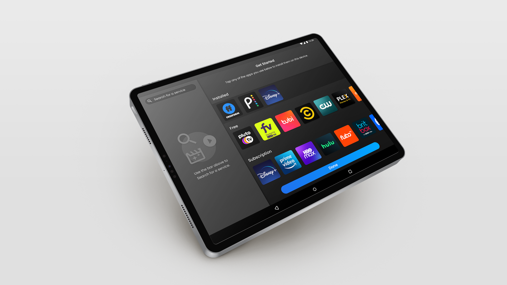
Tablet Experience
The redesign also included the addition of a Tablet experience, shown below. For the Tablet, I really wanted to focus on preserving the same improvements and additions I made for Android, but scaling them up and making them more readily accessible on the larger format screen.
Conclusion
In this project, I was able to significantly improve the look and feel of the Get Started experience, as well as streamline and improve the functions of the screen. The addition of tablet support took one of the hardest parts of FreeCast’s onboarding experience, and instead made it the center stage for further high end UI elements to come.